For 30 years, we’ve been a unique voice, and that includes the design of our communications materials!
With welcoming colors, shapes that convey openness and availability, and photographs of our nonprofit members, NIA’s amicable brand of design doesn’t aim for corporate formality. Instead, it strives for approachability and clarity.
Dottie Lechtenberg, NIA’s in-house graphic designer who has worked with NIA for 24 years, discusses her approach.
What’s your creative process for producing designs that are representative of NIA and its members?
It helps to place yourself in our members’ shoes. We’re a nonprofit ourselves — so we don’t have to imagine being one. We are our members, at the very core. As we like to say, we’re nonprofits’ own insurance company.
When I’m creating a design, I think, As a nonprofit, what do I want from my insurance carrier? I want an insurance provider that is ready to deliver what my nonprofit needs, has proven itself trustworthy over the test of time, and truly cares about protecting my nonprofit.
It’s not too much to ask. That’s what insurance should be, and that’s what we are.
We want to provide our members with more than excellent insurance. We also want to support the important programs, events, and projects our members undertake every day.
That’s why we help our members run their operations smoothly with our risk management expertise and business management resources. I really enjoy my role of presenting these resources in a visually friendly and accessible way.
How do you make information visually compelling for your audience?
I start by thinking about the needs of the audience. For example, if I’m working on an ad for a magazine, I’ll first identify whether the reader is a nonprofit or an insurance broker; both are our customers. You have to think about the purpose of the publication before the purpose of the ad.
When nonprofits are the audience, we want to make sure they understand that we exist to serve them and that we understand the issues they face.
For insurance brokers, we want to communicate our financial strength, our superior coverages, and our customer service, which is remarkable compared to what other carriers provide.
Insurance brokers love working with us because we’re committed to nonprofit insurance and because we’re so easy to work with!
What attracts nonprofits to NIA?
When nonprofits realize that we really are a 501(c)(3) organization that exists solely to serve the nonprofit sector, we have their trust.
Our primary purpose is to make sure nonprofits continue to operate and serve their communities. That’s a completely different objective than our competitors.
Because we’re such an unusual organization, it takes a while to sink in. The realization usually doesn’t dawn on a nonprofit until they have an interaction with us and discover we don’t act like any other insurance carrier out there.
You started at NIA 24 years ago as the receptionist, then as the CEO’s assistant. How did you discover your passion for graphic design?
I’ve always enjoyed artistic hobbies, but I had not pursued them professionally until NIA recognized my talent and supported my desire to take on creative projects and develop my skills.
When I was at the front desk, I started designing a newsletter for our company. I used to actually walk those newsletters to the post office before we switched to emailing them!
I also had the opportunity to design the educational booklets that we provide to our members for free. Then I designed our annual report and informative brochures among other things.
NIA really is a nurturing and stimulating environment for learning and growth.
Our marketing efforts have evolved over time. We didn’t have an actual marketing department back then, so we hired contractors, but as the company grew, we brought those projects in house.
In that transition from outside contractors to your in-house graphic design work, did you see a difference in how the message was conveyed?
Yes. It was hard in the beginning trying get outside contractors to understand what we do, because we’re so unique. Even our message was different in the beginning.
In the early days, we had to prove ourselves as a strong financial institution. Now, we have a track record that stands for itself! So, we can look less corporate and let our designs speak more about our mission, which is far more interesting.
Tell us about the NIA logo.
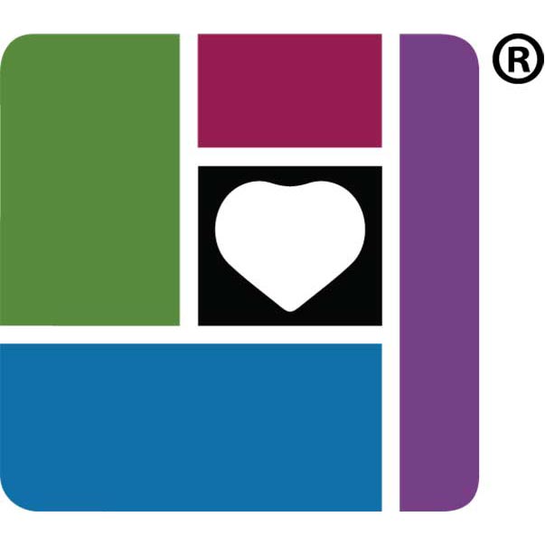
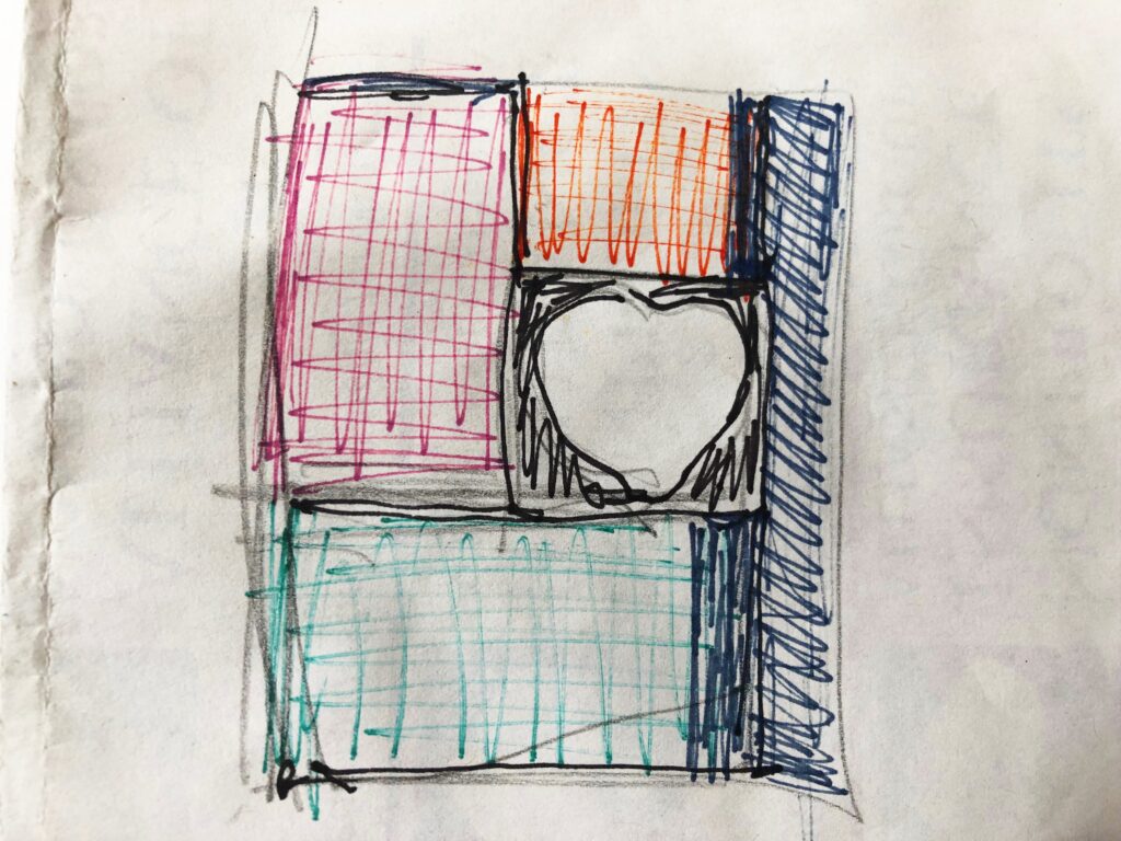
Our founder and CEO (an artist herself in her spare time) literally sketched our logo on a piece of paper and handed the rest to me. The four outside shapes represent the companies in our cooperative. In the middle is a heart, signifying our commitment to nonprofits.
Our first company NIAC (Nonprofits Insurance Alliance of California), the original founding component, is represented at the bottom rectangle in blue.
Then, ANI (Alliance of Nonprofits for Insurance), represented in green, grew out of NIAC and extended our reach.
The purple shape on the right represents the backing of NANI (National Alliance of Nonprofits for Insurance), a captive reinsurer that is part of our group.
Finally, there’s AMS (Alliance Member Services) — the management company that employs our staff, in red, next to the heart that represents the nonprofit sector.
The logo is a great reminder to our members, brokers, and our staff at this unique cooperative that a heart for nonprofits makes us who we are!
Dottie Lechtenberg is the Creative Specialist at Nonprofits Insurance Alliance. Originally from Nashville, Tennessee, she has lived on the Central Coast of California for 30 years.
In her spare time, she enjoys being with friends and family, volunteering at a variety of nonprofit organizations, making crafts like cards and mosaics, and gardening.


